Histograms, Measurement, and Uncertainty
You've
probably run into this symbol before: +/-. You see it in the news when
political polls are being discussed, or in science textbooks. You know it has
something to do with "error". But what does it really mean?
Part
of the confusion is that it seems to mean different things at different times.
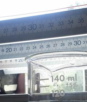
Let's say you're in science class. You fill a graduated cylinder with water up
to the 50 mL mark. At the top of the beaker it tells you that the beaker is
accurate to +/- 0.5 mL. You take that to mean that
the water in the beaker could actually be as low as 49.5 mL or as high as 50.5
mL, but definitely not outside that range.
Now
let's say you're reading a news report. A bunch of people were asked to rate
how well a political leader is doing, on a ten point score. The news reports
that the average was 5.5 +/- 0.2. So does that mean that all the people polled
picked a score between 5.3 and 5.7? That doesn't seem possible; you know that
some people hate this political leader and others love her.
To
sort this out, we need to start by talking about uncertainty. Some people call
it "error", and mean the same thing, but "uncertainty" is a little more
accurate. So what is it? Well, any time you (or anyone else) measures something,
whether it be mass, length, calorie intake, heart rate, public opinion, average
happiness, or anything else, you're limited in how precisely you can know your
result. Your ruler doesn't have ticks all the way down to nanometres, or each
hamburger has a slightly different number of calories, or you can only poll
1000 people and extrapolate out to 100,000,000 people. All measurements are
limited. So we need a way to express how well we actually know the result of
our measurement, which is where uncertainty and the +/-
symbol come in.
As
an aside, since all measurements are limited, you should always be a little
suspicious when you read about a measurement and the uncertainty isn't mentioned.
Uncertainty is always there; if it's not mentioned the person
writing the article either didn't know what it was or deliberately left it
out--in either case it's a red flag that there could be a problem with the
article.
You
may have noticed that I'm being a little vague about uncertainty. This is
actually on purpose. It turns out that there are a bunch of different ways of
mathematically expressing "how well we actually know the result of our
measurement." It's not that some are right and some are wrong, but that
different measures make sense in different contexts. The graduated cylinder
example and the political poll example are using two different measures of
uncertainty because each is using a measure that makes sense for that context.
Before
we can really talk about that, though, we need a more concrete idea about what
uncertainty is. So now I'm going to introduce a particularly powerful tool for
understanding measurement and uncertainty: the histogram.
Histograms
are a type of graph, though they're a little more abstract than the type of
graph you may be used to. A histogram takes a bunch of individual measurements
and plots the number of times a given measurement occurs against the value of
that measurement. It really helps to have a concrete example here, so let's go
through one.
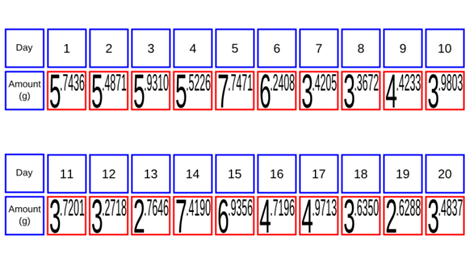
Suppose
you have a pet hamster. You want to know, "How much food does my hamster eat in
a day?" So you start weighing its food each day. You do this for 20 days, which
gives you the following table:
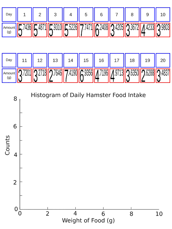
You'll
notice that the amount moves around a bit; the highest amount is more
than 7
grams, while the lowest is less than 3. So while you can add them all
up and
average them to get 4.77 grams per day, you also want to somehow
communicate
what the range around that is. To do that, we'll re-sort each day's
measurement. First we create a plot with "Weight of Food (g)" on the
x-axis and "Counts" on the y-axis. Then we stack each day's measurement
on our plot: all
the measurements between 2 and 3 get stacked in the space between 2 and
3 on
the x-axis, and likewise for measurements between 3 and 4, between 4
and 5,
etc. Here's an animation of what I mean:
As
an aside, we call these ranges "bins". They don't have to be integer numbers; I
could have stacked all the measurements between 2.0 and 2.5 in a separate pile
from the ones between 2.5 and 3.0. Picking good bins is an art unto itself; I
won't say much about it here except that the only overarching goal in picking
bins is to get a useful histogram. For this example, integer bins work well.
Now
I have a plot of the number of times I got a certain measurement vs what that
measurement was. As you can see, it has a hill-like structure: most of the
measurements were in the 3-4, 4-5, and 5-6 bins, with a few in the surrounding
ones and none smaller than 2 g or larger than 8 g.

Already
this plot helps us to visualize our data, but we can do more. In the next plot
I'm going to add something we call a distribution. This is a curve that
represents the ideal, what our histogram "should" look like. You can see that
it's smooth, unlike our actual histogram, and shaped somewhat like a
bell--which is where the term "bell curve" comes from.
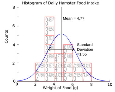
There's
two properties of this distribution that you might be familiar with. The first
is the mean. You might know it better as the average--we use the term "mean"
because our everyday usage of "average" can actually refer to a few different
things. It's the centre of the peak, and also what you get if you add up all of
your measurements and divide by the number of measurements you made. The second
quantity that you may have encountered before is something called the standard
deviation. This is a measure of how wide the peak is. You can get if from your
data with formula:
![]()
This
formula tells you that the standard deviation is the sum (![]() of
the difference between each measurement and the mean
of
the difference between each measurement and the mean ![]() squared,
divided by the number of measurements, all square rooted.
squared,
divided by the number of measurements, all square rooted.
That
seems complicated, but the key point here is that it represents how wide your
distribution is, or equivalently how spread out your measurements were. For our
hamster food, the mean is 4.77 grams, and the standard deviation was 1.34
grams. There is another thing we might like to know. And that is, how certain
are we that our distribution is the right one? A distribution with a mean of
4.77 and a standard deviation of 1.34 was the one that best fit the histogram
we have, but we can move the distribution to the left, like this,
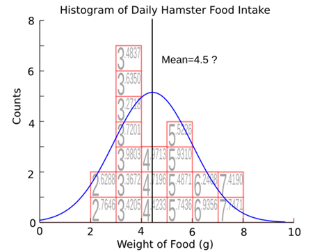
or
to the right, like this,
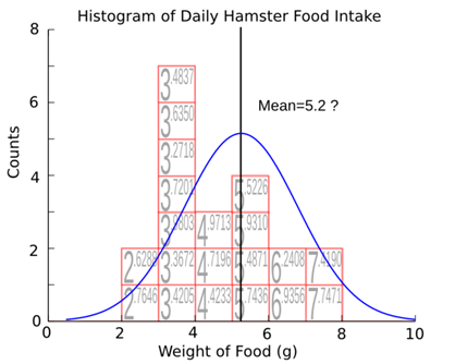
and
looks like it fits our histogram almost as well. This quantity, how far we can
move our distribution before it stops fitting our histogram, is called the
standard error. Conceptually, it is how certain we are that the average we got
from our data is the right average. Mathematically, it's given by the formula
![]()
If
you look at the formula, you'll notice two things. First, the standard error is
proportional to the standard deviation. That means that the more spread out the
data is, the bigger the range we need to put on our average is. This makes
sense: if every day our hamster had eaten exactly 4.5 grams of food, we'd be
pretty confident that the daily average was very close to 4.5--certainly not
4.8, say. On the other extreme, if every day the hamster had eaten a widely
different amount--some days 0.5 grams, other days 15 grams, we wouldn't be very
confident in the average we got after only 20 days. We might want to watch the
hamster for longer to make sure we were getting the right average.
This
brings us to the second part of the equation for standard error. The ![]() in the bottom means that the standard error
goes down as the number of measurements goes up. Intuitively, this makes sense:
the more measurements we make, the more confident we are that our average is
true. To further flesh out these three important quantities (mean, standard
deviation, and standard error) we can look at histograms for our hamster data
as we take more and more of it. We've already looked at the data for 20 days.
in the bottom means that the standard error
goes down as the number of measurements goes up. Intuitively, this makes sense:
the more measurements we make, the more confident we are that our average is
true. To further flesh out these three important quantities (mean, standard
deviation, and standard error) we can look at histograms for our hamster data
as we take more and more of it. We've already looked at the data for 20 days.
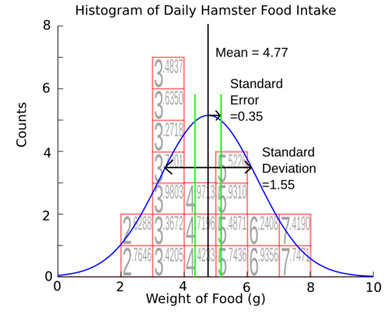
You
can see I've added some green lines to indicate where the standard error is.
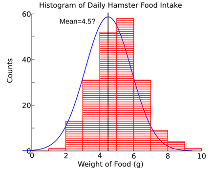
Now we follow our hamster for 200 days:

You'll
notice we have a lot more counts here; that's fine, we can still overlay our
distribution. What happened to our three quantities? The mean moved a bit--we
expect this to happen. After all, if the mean never moved when we added more
data, it would mean that our original estimate was exactly right, in which case
there wouldn't be any uncertainty. The standard deviation moved some too. It
happened to have gotten smaller, but this won't always be true. The standard
deviation remains approximately the same, but tends to move around fairly
randomly as you add more and more data. Looking at the standard error, you can
see it got much smaller. Another way of seeing this is to notice that the
bell-shape of our histogram is much more defined. What this means is that the
uncertainty in the average is much less, because we couldn't move our
distribution very far either way before it was a noticeably worse fit to our
data. For example, if we tried to move our distribution to the left like we did
above, we get:
Unlike
our 200 day example, this is clearly a much worse fit than a mean of 5.05.
Now
we follow our hamster for 20,000 days. Okay, hamsters don't live that long, but
we can imagine that we've gotten together with all our friends to compile the
results of a hundred hamsters for 200 days each.

The
same trend happened here as did before: the mean and the standard deviation
moved a little, and the standard error got a lot smaller--so small that the
green lines have disappeared. You'll notice that the histogram is now
practically an exact fit to the distribution, which means the distance we could
move the distribution in either direction is extremely small.
Now
we're in a position to take another look at what uncertainty is. Let's ask two
different questions. 1. How much food on average does a hamster in my
neighbourhood eat each day? 2. How much food will my hamster eat tomorrow?
The
best answer I can give to question 1 is 4.979 +/- 0.009 grams. The best answer
I can give to question 2 is 5.0 +/- 1 gram. Let's go over the difference
between these two answers. In the first case, I want to know how confident I am
in my mean. In this case I use the standard error as my uncertainty, because
the standard error represents the amount I could move my distribution and still
fit the histogram; it's the uncertainty in the mean. In the second case, I want
to know what I can expect on a typical day. Here I use the standard deviation
as my uncertainty, because the standard deviation represents how much a
hamster's food intake might vary from day to day.
Now
let's go back to the examples we started with. A graduated cylinder says "+/-
0.5 mL" on it. What this means is that the company that makes the graduated
cylinders took a whole bunch of the cylinders off the line at the factory and
used each them to measure, say 100 mL of water, at various temperatures
conditions. They read off the measurements and built a histogram like we did
above, and found that the standard deviation of the measurements was 0.5 mL. They report the standard deviation because what you
want to know is how far away from the true value your individual graduated
cylinder is likely to be.
The
pollster who reports the result of a ten-point approval scale is using the
standard error for their uncertainty. In that case, you're not too concerned
with how likely it is that your neighbour's opinion is far from that mean.
Instead you want to know how accurate the mean itself is; in other words, how
much the poll would change if it was extended to the entire country. Since the
standard error is a measure of uncertainty in the mean, it's a good choice to
use here.
Keep
in mind the uncertainty represents our knowledge, as the name suggests. It's
possible, in the graduated cylinder example, that you
happen to have a particularly well calibrated cylinder, in which case your
readings are actually closer to the true volume than 0.5 mL; but since you
don't know this, your uncertainty is still 0.5 mL.
It's even possible to change the uncertainty: you could calibrate the cylinder yourself,
using some other, more precise way of measuring volume. You could build a whole
table this way, so that you knew that when the graduated cylinder read 50 mL,
it actually held 50.35 +/- 0.05 mL. If you did that,
the uncertainty on the cylinder would be less, because you would know more
about it, even though the graduated cylinder didn't actually change.
There
was a lot in this article, so let’s go over the important points.
-
Uncertainty is always present when
you measure something, because no measurement tool is perfect. You should
expect measurements you read about to report uncertainty, and be suspicious of
those that don't. You should also report uncertainty in your own measurements
if you want other people to have confidence in them.
-
There are a number of different ways
of calculating uncertainty. Which way you should use depends largely on the
context you're using it in.
-
Histograms are useful tools for
visualizing and understanding data. They consist of a graph that plots how
often you got a certain measurement against the value of that measurement.
-
Three important quantities you can
get out of a set of data are the mean, the standard deviation, and the standard
error. The mean is the average. The standard deviation tells you how spread out
the data is. The standard error tells you how confident you are in the mean you
found. You might use either the standard deviation or the standard error as
your uncertainty, depending on the situation. The standard deviation is
appropriate as the uncertainty on a single measurement. The standard error is
appropriate as the uncertainty on the average of a number of measurements.
Hopefully
now you have an idea of what the number after the +/- sign means. Now go use
it!
Futher
reading and resources:
Data Reduction and Error Analysis in the Physical
Sciences, by Bevington
and Robinson (McGraw-Hill 2003) is a bit high level, but the first few chapters
give an excellent and concise introduction to some of the topics discussed
here. The wikipedia articles on mean, standard deviation, standard error, and normal distribution are all good places to start.
To
actually do the calculations I did to generate all the plots shown here, I
used Octave, which is a free version of Matlab,
and gnuplot,
which in addition to plotting also has a variety of fitting options. To make
the graphs more informative I used Inkscape, a free drawing tool for Linux
and Mac.
copyright: Physics and Astronomy Outreach Program at the University of British Columbia
(Eric Mills 2013-08-21)